Brand naming, identity and packaging design for a new Turkish chocolate company.
The brand takes inspiration from its founder’s scientific profession, using gridded layouts and the (tasty) volatility of watercolour paint.
The brand takes inspiration from its founder’s scientific profession, using gridded layouts and the (tasty) volatility of watercolour paint.


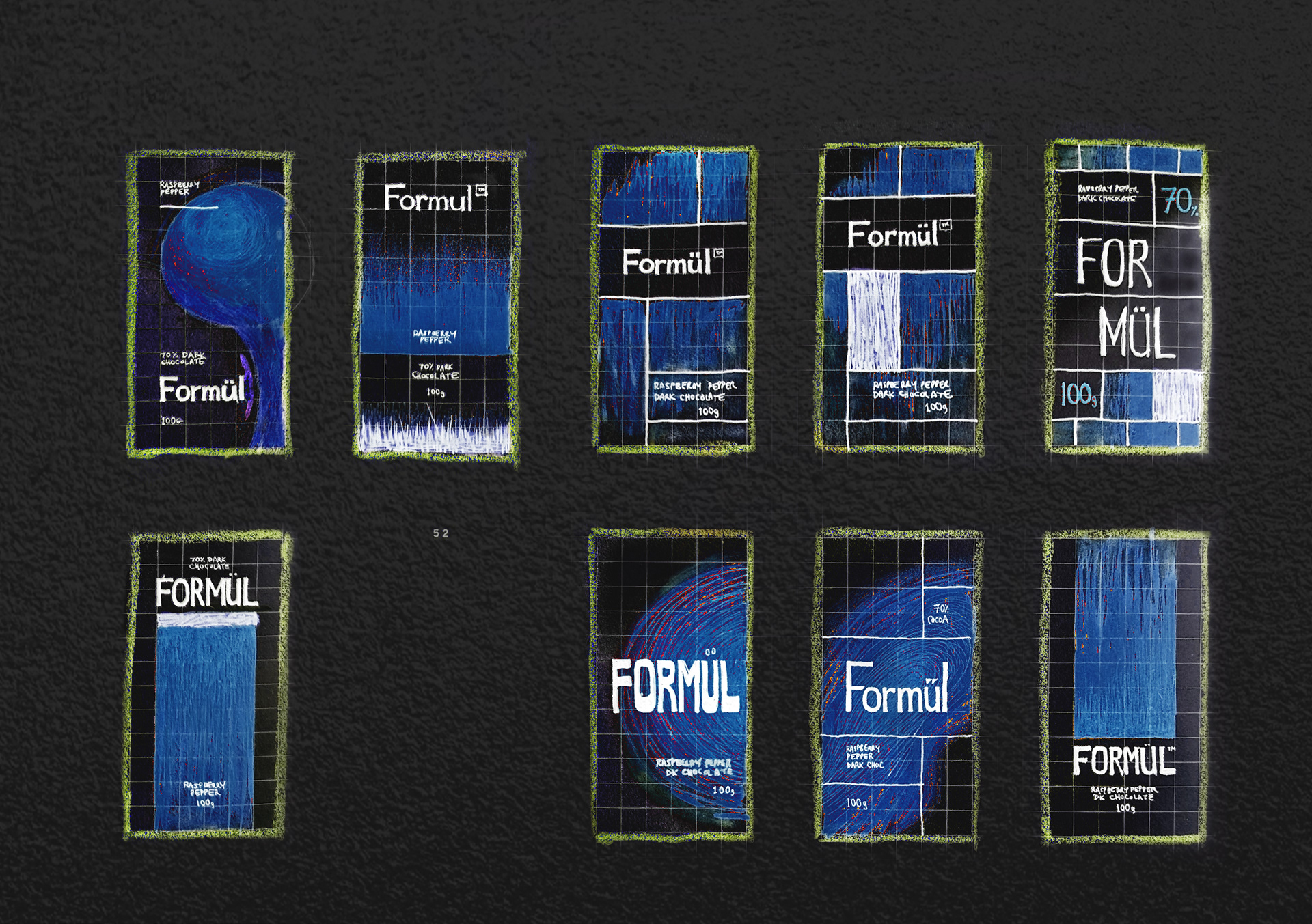
Launching a chocolate range free from dairy and additives presents some challenges - tasting great and standing out. Relevant to both was the company founder's career as a chemical engineer - the thought and experimentation that went into her recipes could translate into a unique visual approach.
Initially inspired by the chemical process of chromatography, this brand identity illustrates the range's flavours with authentic painted textures. TOV, 'element' boxes and an in-your-face grid celebrate the founder's analytical approach for an urban, aesthetically aware audience.
Initially inspired by the chemical process of chromatography, this brand identity illustrates the range's flavours with authentic painted textures. TOV, 'element' boxes and an in-your-face grid celebrate the founder's analytical approach for an urban, aesthetically aware audience.