A full rebrand for Manchester United WFC, asserting the team’s independence while valuing its heritage. A defiant identity for the birthplace of the Suffragette movement and Industrial Revolution, highlighting accessibility and inclusivity.

This risky but exciting rebrand project for Manchester United Women was achieved by listening to what's important to fans, and respecting the team's Red Devil heritage. This new name, new badge and new identity hope to encapsulate what's important to a team that's had to fight to be where it is today.
Some non-negotiables were keeping the primary brand colour and home kit colour – and once a way was found of using a heritage asset (the trident held by the previous club crest's devil) to foreground the M for Manchester, there was a way forward for the new crest.
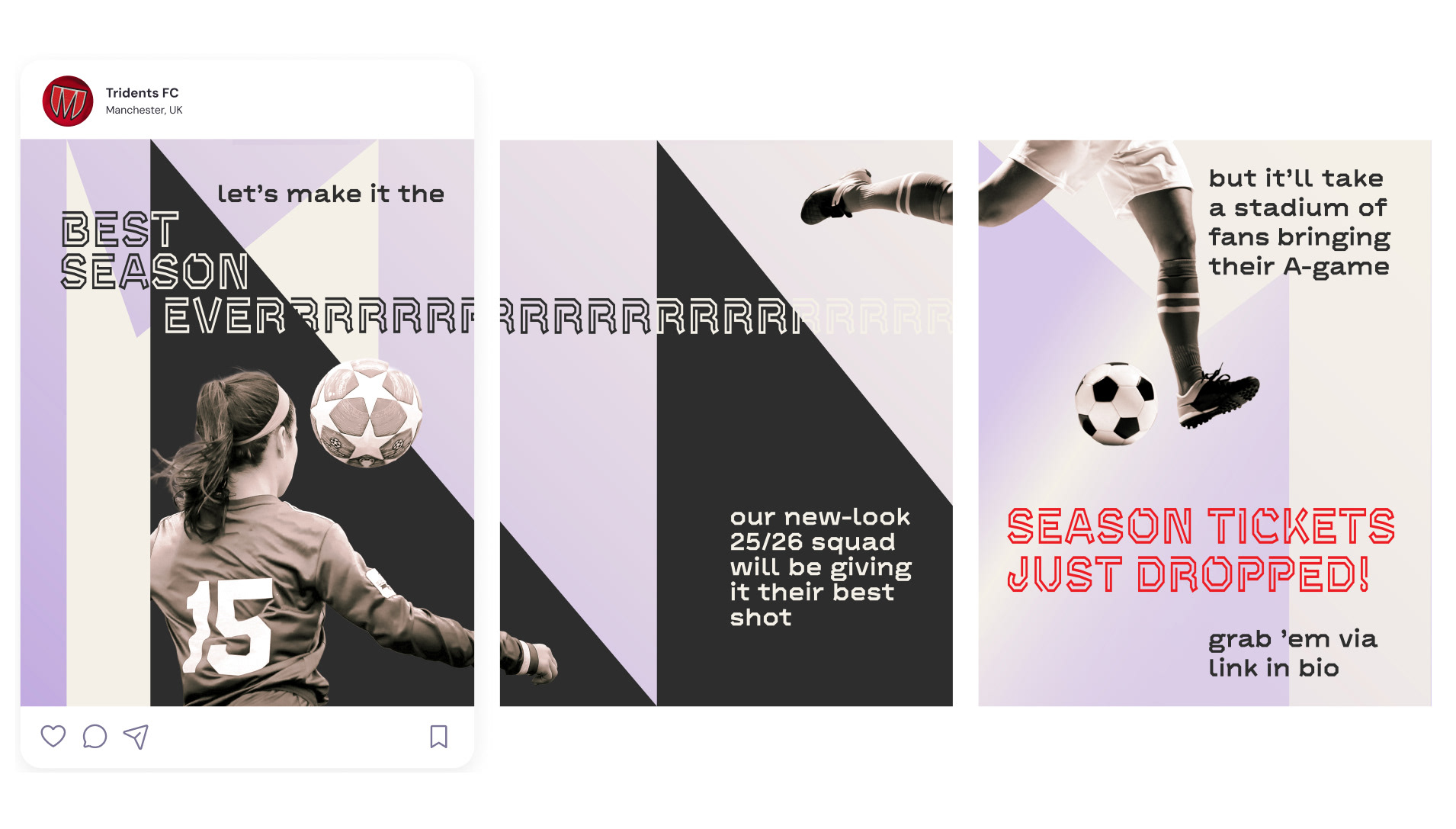
The result is a clear, adaptable brand mark that in its simplicity can grace campaigns, merchandise and be worn on the chest with pride.
References to Manchester as birthplace of the Suffragette movement, in the context of women taking risks in order to demand equality, is not too much of a conceptual stretch. Whether it be a 50-year FA ban on women's football, or United's board opting to close down the women's team in the early 2000s, subtle references to this seemed to make sense – hence light purple as a secondary brand colour, one recurring part of the suffragette movement's visual language.
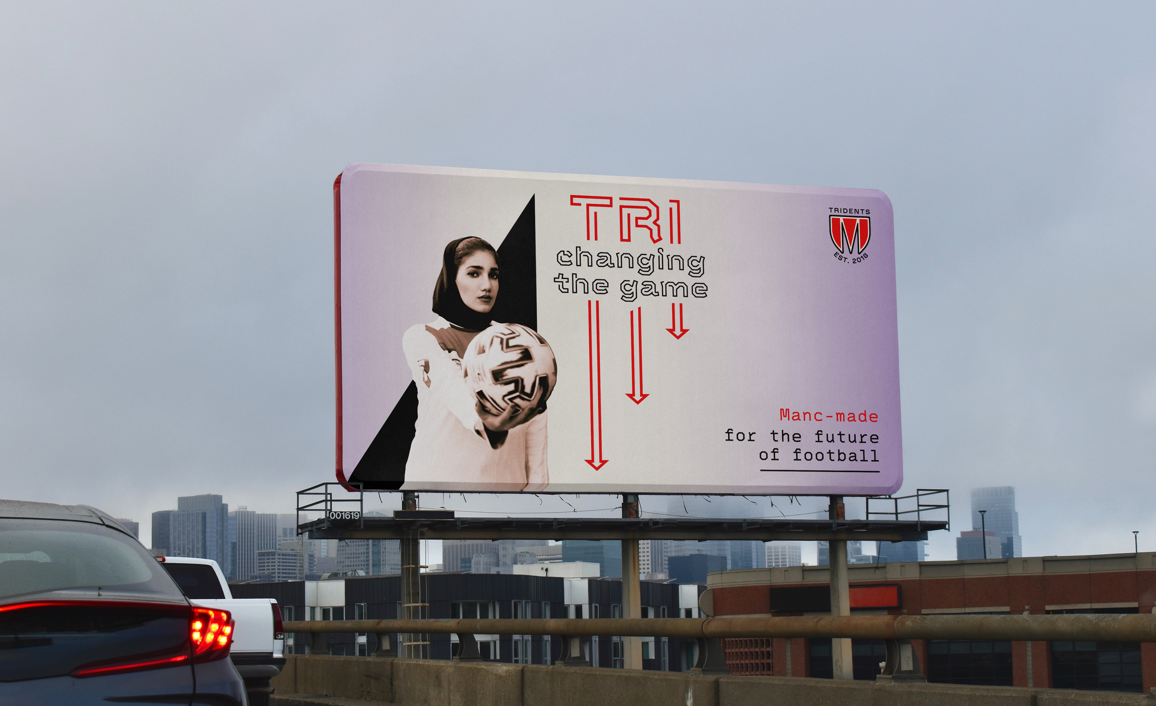
Angularity is employed here, with graphic elements that represent Manchester's architecture. And tone of voice is vital – though the identity has elements of militancy, the language is more about excitement and involvement. An ad campaign will be based on the first three letters of the club's name, encouraging people to “TRI” - try joining a grassroots club, try speaking differently of sportspeople and rivals, try being part of a cultural change.
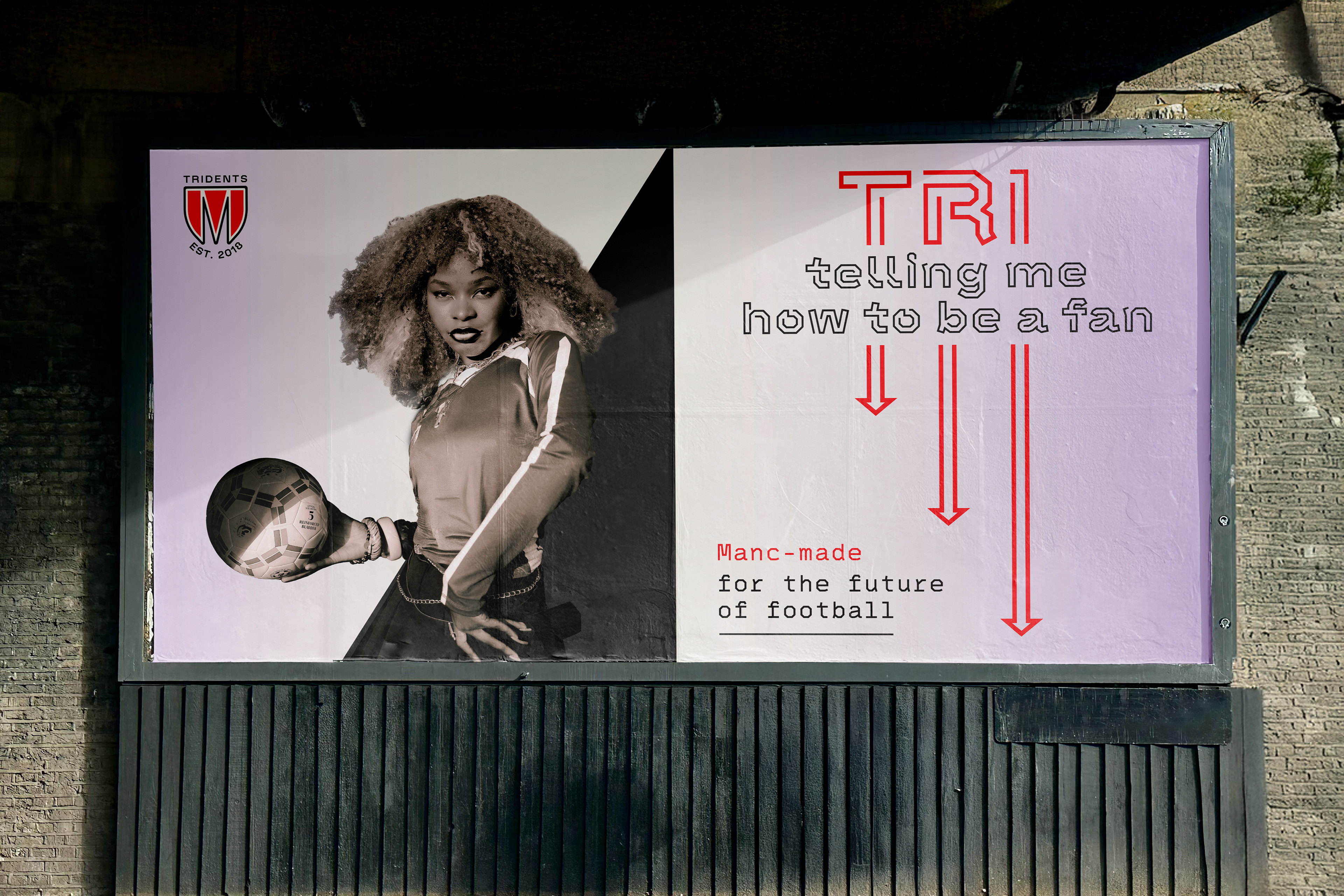
This is a team born in the North of England, one that has gathered silverware and earned respect despite being only seven years old. It's full of international stars who got involved in the beautiful game in the first place because they had the guts to TRI.
But it refuses to be defined by history. If the next generation are as unapologetic, as ready to show up in their fits and finery, as open as football can be at is best - then the future's bright. And this brand was built for the future.