
An ongoing rebrand project encompassing Christ Church Woking, and its attached business, Sanctuary Books + Gifts. To coincide with their shared building being renovated, they wanted previous "tired", inconsistent branding to be replaced with an identity that communicated their values to the wider, evolving community.
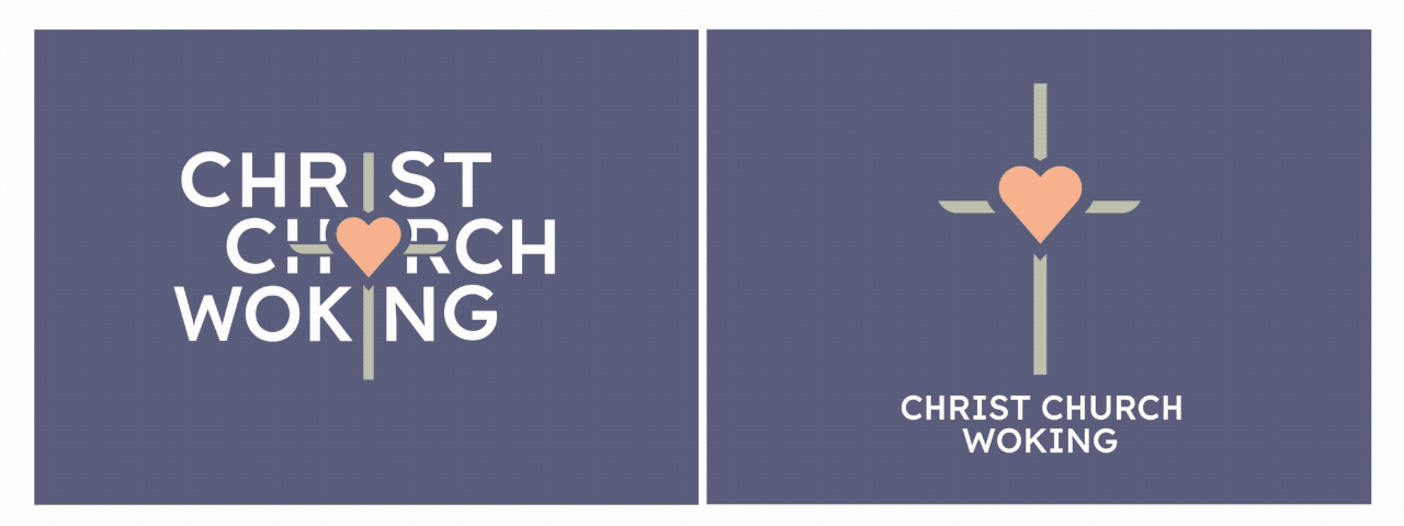
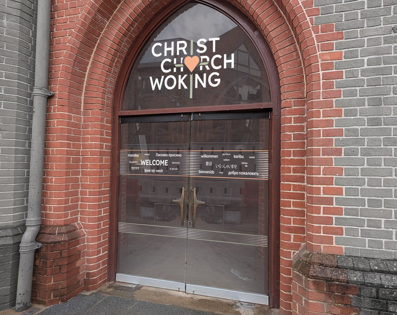
We decided to home in on the client's vision statement for its next five years: "showing the heart of God in the heart of Woking" - it wanted to show clearly that love was at the core of who Jesus was, and that he was at the core of what Christ Church does. And in a very international area, it felt important to combine recognisable symbols to articulate this throughout the identity.
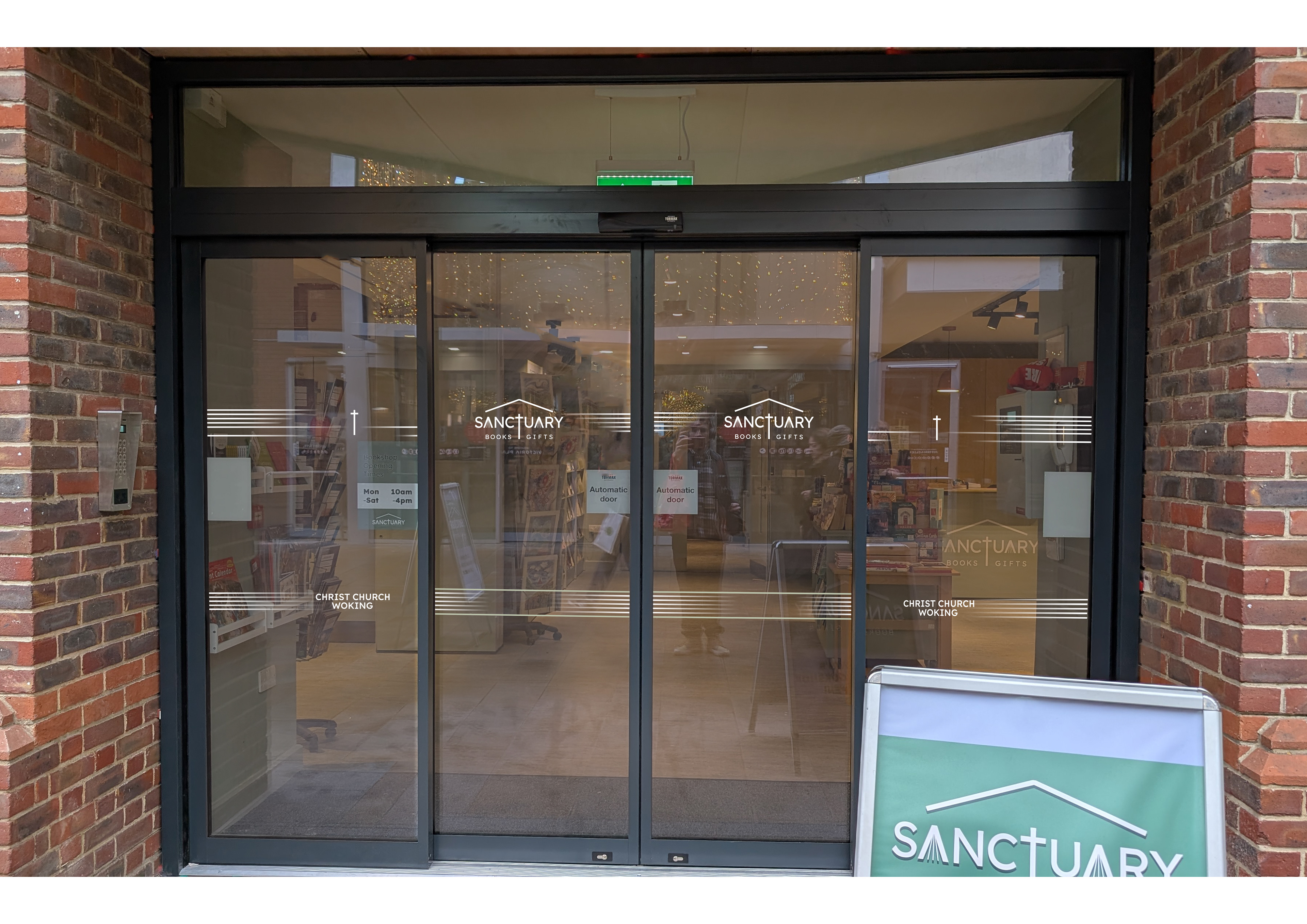
The project was made more complex by including CCW's bookshop - a distinct but related entity with its own entrance in the same building. Beginning here, I decided that the whole project would be united by type with some overlap in their respective colour palettes. Lexend would be employed throughout - a face designed for accessibility (open-access allowing the CCW staff team to run with it for years of in-house comms production). Based on the work of another draughtsperson, I designed and installed signage in the shop itself.

The bookish theme is carried through by including 'pages' in the 'A' letterform, and the horizontal lines of window manifestations evoking those of a closed book.
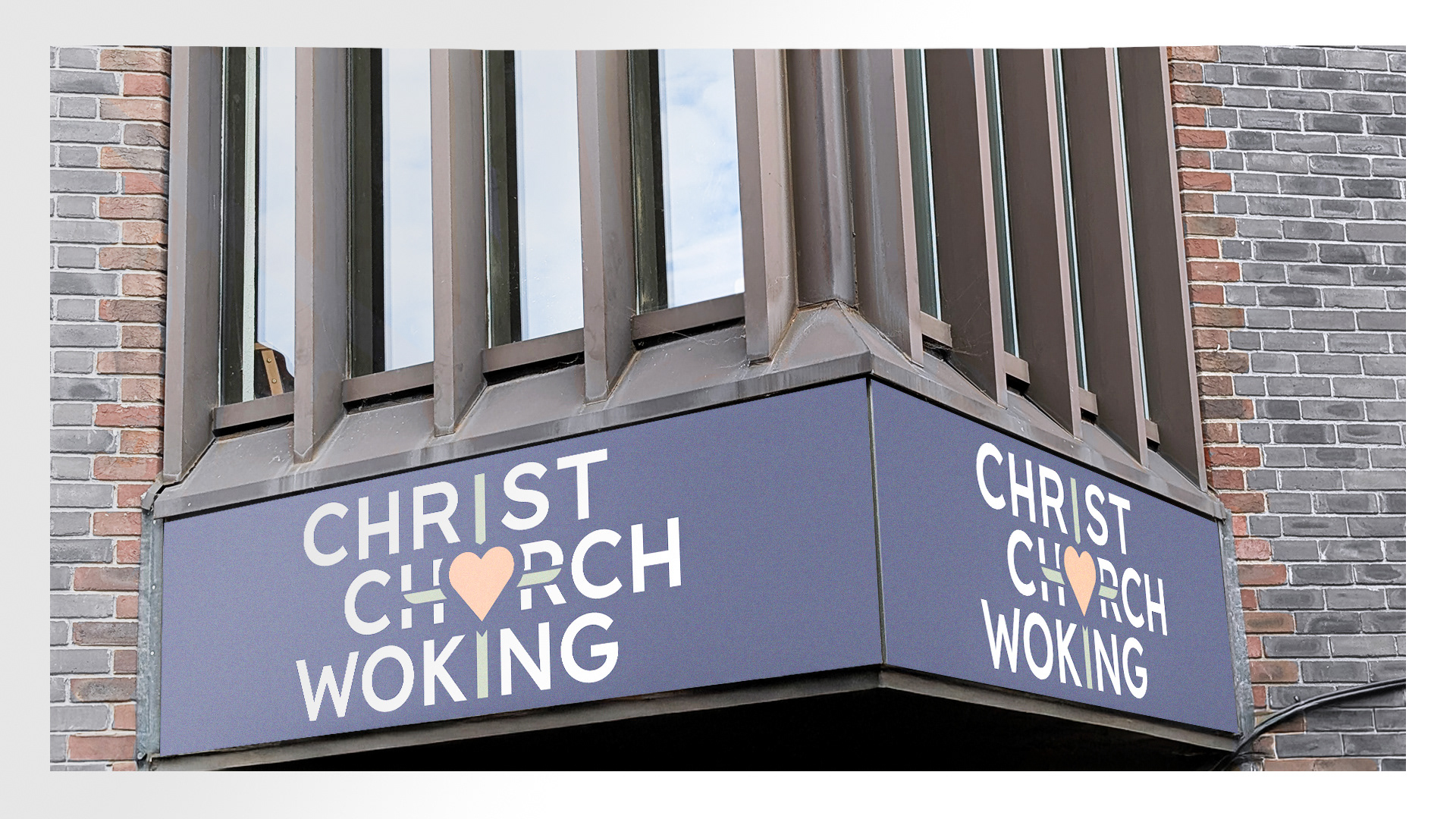
On site at Christ Church, the congregation's three services required identifying features including countdown videos, and templates for slides and newsreels. Throughout these, as well as using the cross/heart motif to anchor all the church's various strands, we celebrated the importance of being back in the building - the heart now flares out into the shape of a location pin, and texture is subtly included that was scanned from the raw concrete of the renovation. CCW deserves a brand identity that revels in its vision, its diverse community and its location at the very heart of the town.